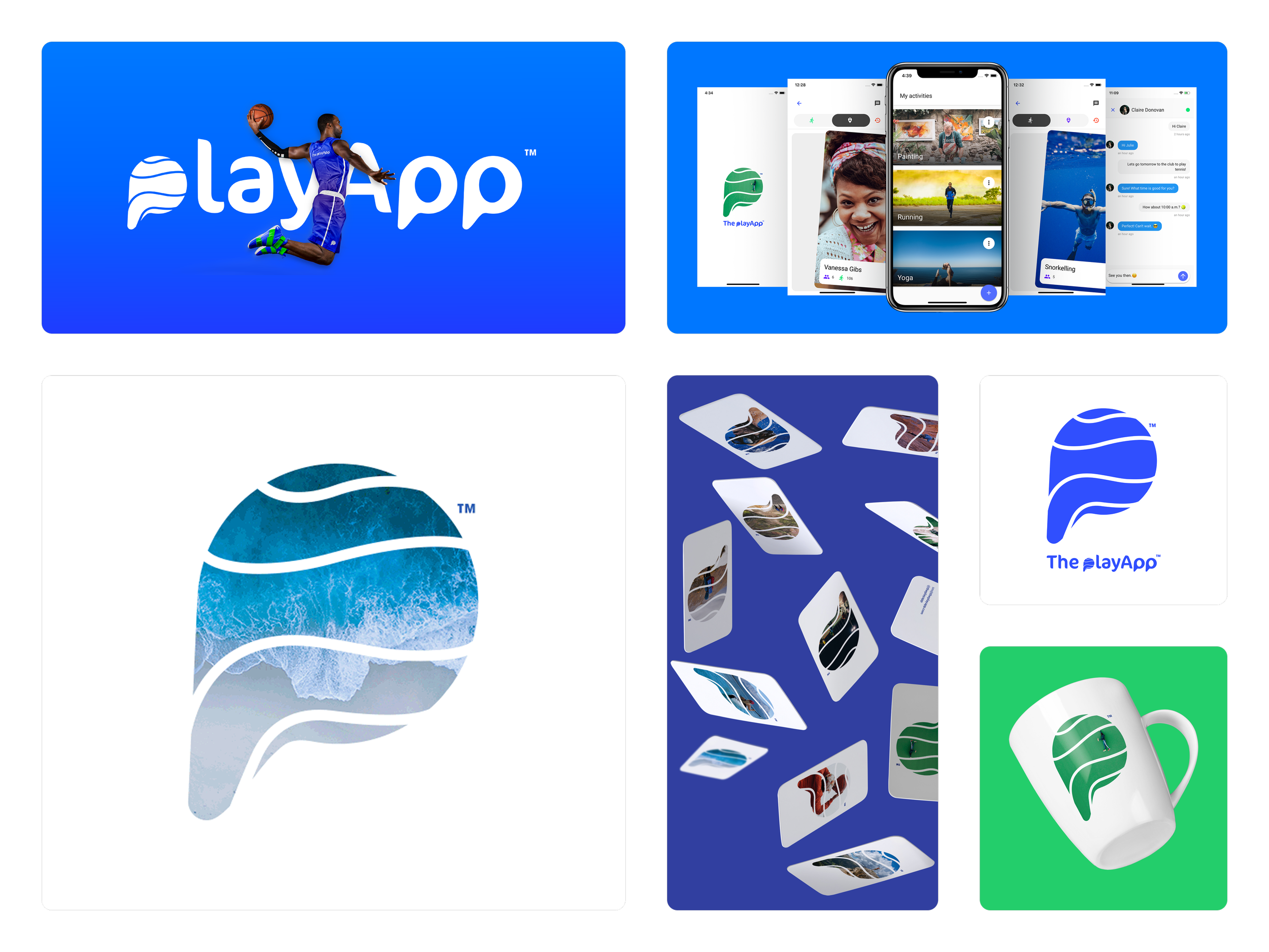
playApp

Brand Identity · UI/UX Design

Play isn't just for kids. Science backs it up — and playApp was built around that idea.

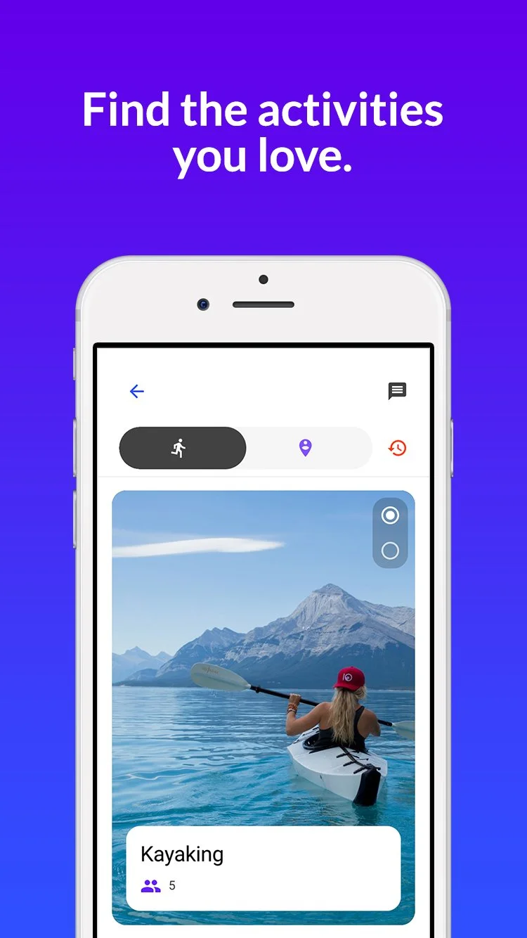
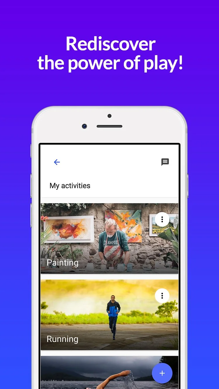
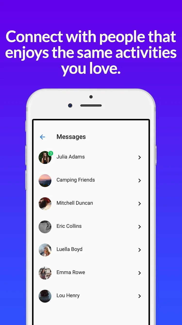
The concept was simple: find people near you who share the same activities, swipe to connect, start doing the things you love with people who get it. A library of hundreds of activities and a messaging system that made finding your people feel effortless.

The brand needed to carry that energy — playful but credible, backed by real research and built for adults who'd forgotten that play is essential, not optional.

I developed the full brand identity and collaborated with a designer-developer on the UI — making sure the experience felt as good as the idea behind it.

A logo with a stylized whale shape filled with an image of ocean waves and sky, incorporating white curved lines.
The image shows the branding and mobile app interface of 'PlayApp'. It includes a logo with a stylized green leaf and waves, a person skydiving wearing blue sportswear, screens displaying various app features such as activity tracking, messaging, and photo sharing, as well as a set of illustrated app icons and a white coffee mug with the green leaf logo.
A person kayaking on a lake with mountains in the background, wearing a red hat, in an app interface showing activities list, with the activity 'Kayaking' selected.
Smartphone screen displaying a fitness app with activities named Painting and Running against a purple background with the text "Rediscover the power of play!"
Smartphone screen displaying a messaging app with conversations from friends and a purple background that says, 'Connect with people that enjoy the same activities you love.'

“Their attention to detail and commitment to quality truly stood out. We’ve already recommended them to others.”

— Former Customer