
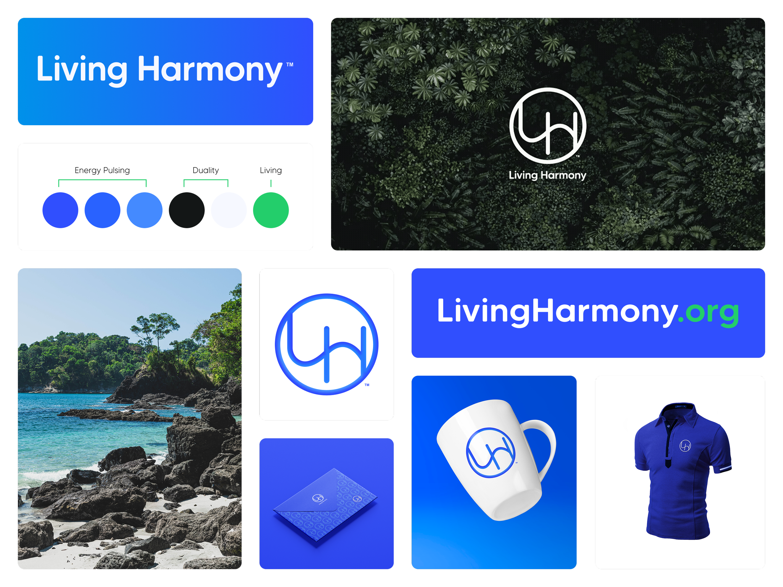
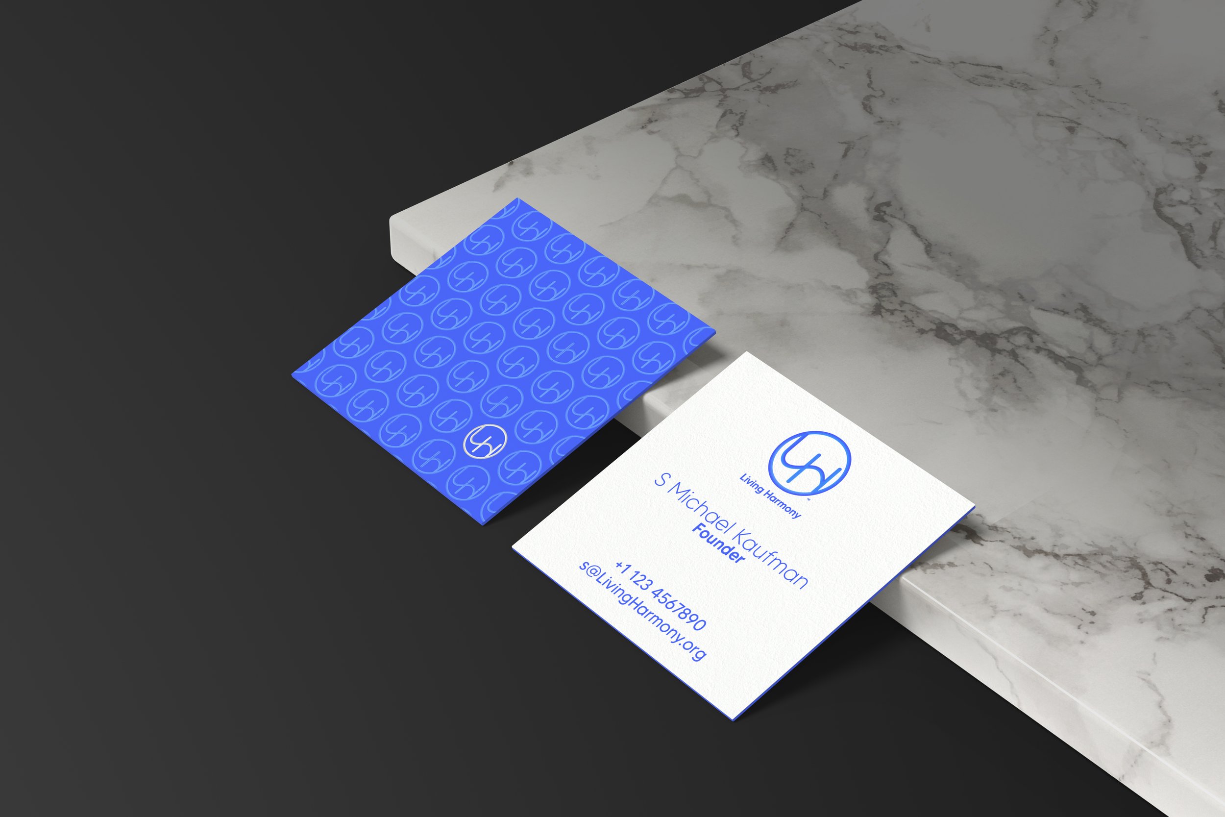
LIVING HARMONY
Brand Identity · Website
Some projects arrive fully formed. This wasn't one of them. Living Harmony started as a concept — a retreat space, a philosophy, a way of being — and my job was to give it a visual identity before it fully knew what it was.
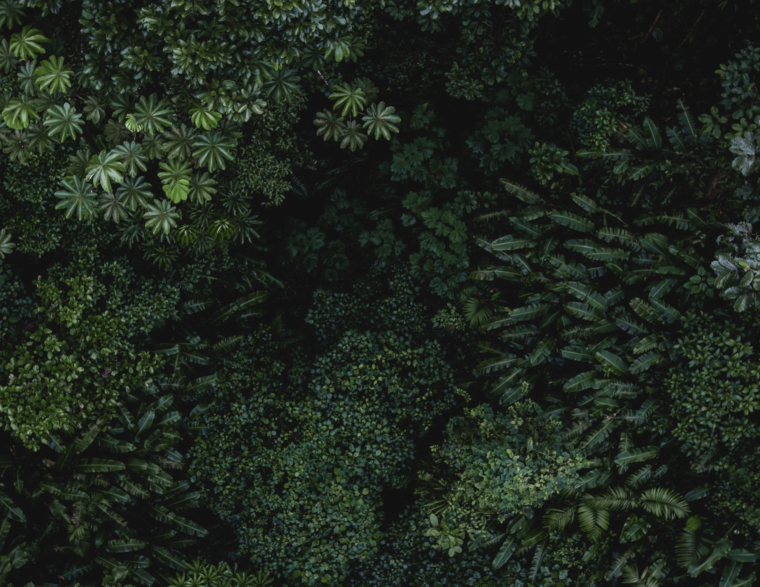
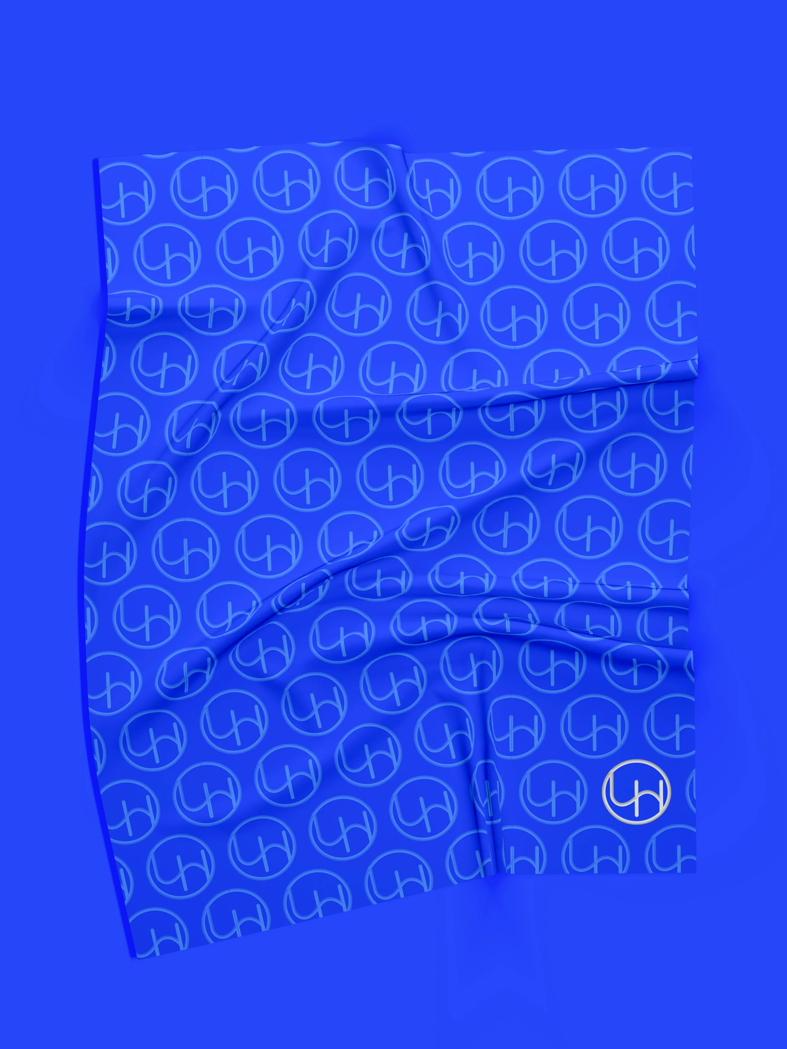
The brand needed to communicate something universal — balance, nature, community, the quiet practice of focusing on what you can control. I found the answer in Costa Rica's landscape. The color palette is pulled directly from it — every shade chosen with intention, the movement between them reflecting the idea that harmony isn't static. It shifts. It breathes.
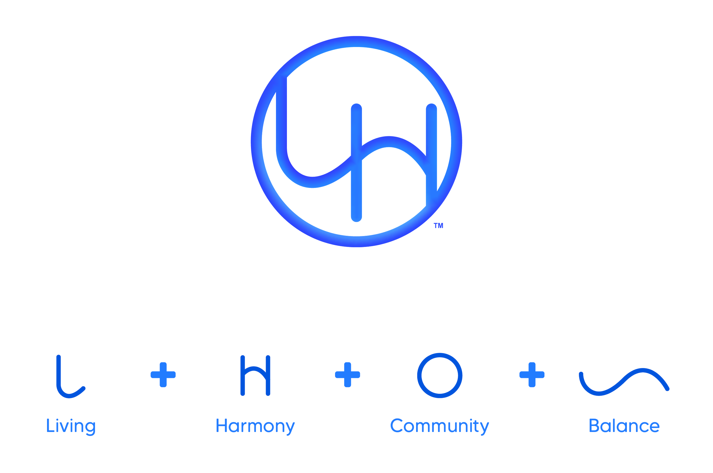
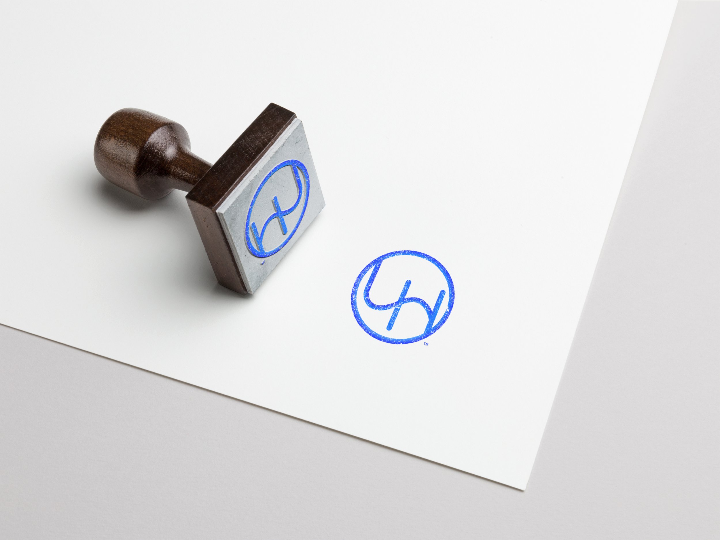
The logo does the same. The L is Living. The H is Harmony. The wave is balance. The circle is community. Four ideas, one mark.
I’ve worked with Majo for close to a decade, across a wide range of projects—from brand identity and book design to app development and e-commerce—and what has consistently stood out is her ability to adapt to any idea or challenge I bring her way.
No matter how different each project has been, she quickly understands the vision and translates it into work that is both thoughtful and effective. She brings fresh ideas, asks the right questions, and always keeps things moving forward.
Just as important, she brings a positive energy and a true can-do attitude to everything she takes on. No matter the pressure or complexity, Majo shows up ready to solve problems and make things better—and she’s genuinely a pleasure to work with and be around.
Over the years, I’ve watched her grow into a well-rounded creative professional who thinks strategically, not just visually.
Her communication is clear, her delivery is consistent, and working both in person and remotely with her has always been seamless. She is genuinely invested in the success of every project she touches.
I would recommend Majo to anyone looking for a designer and collaborator who can keep up with your ideas, grow with your vision, and deliver work that truly matters.
— Miguel