
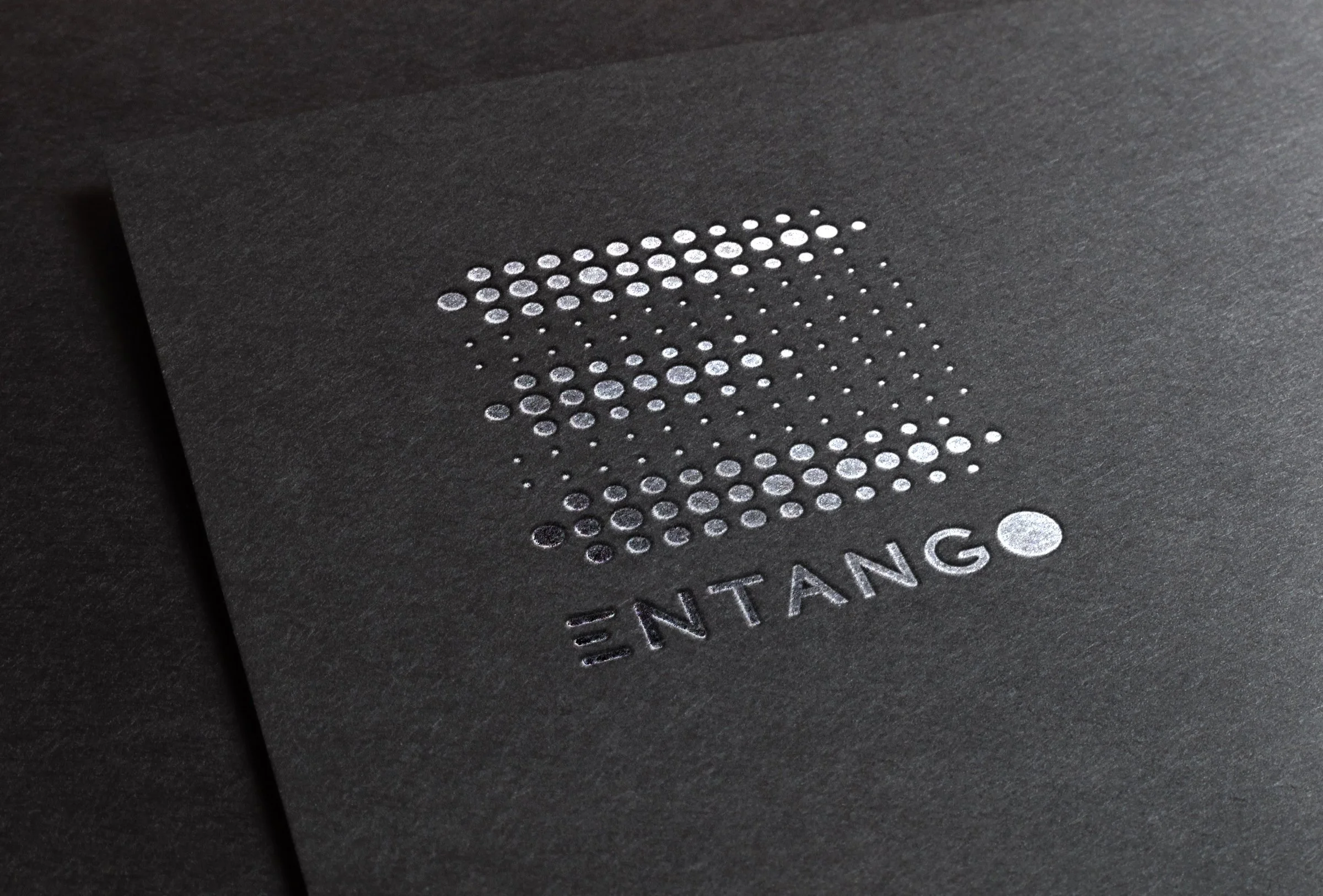
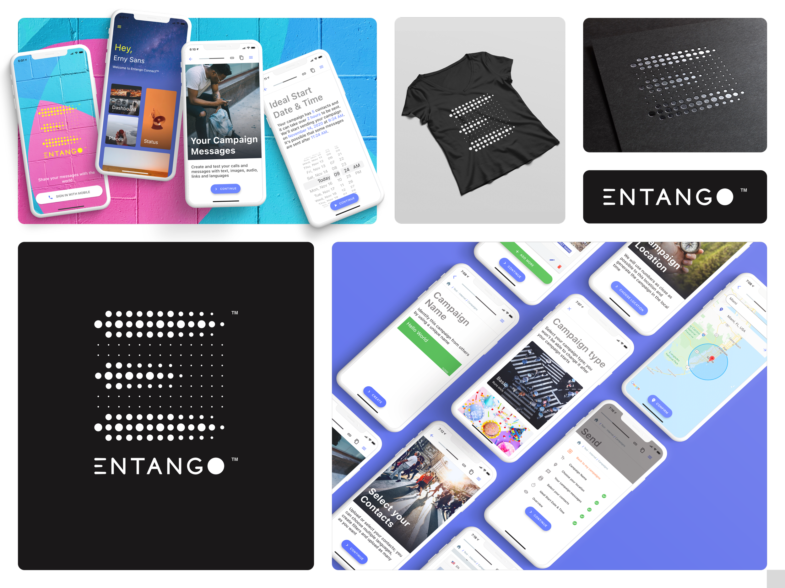
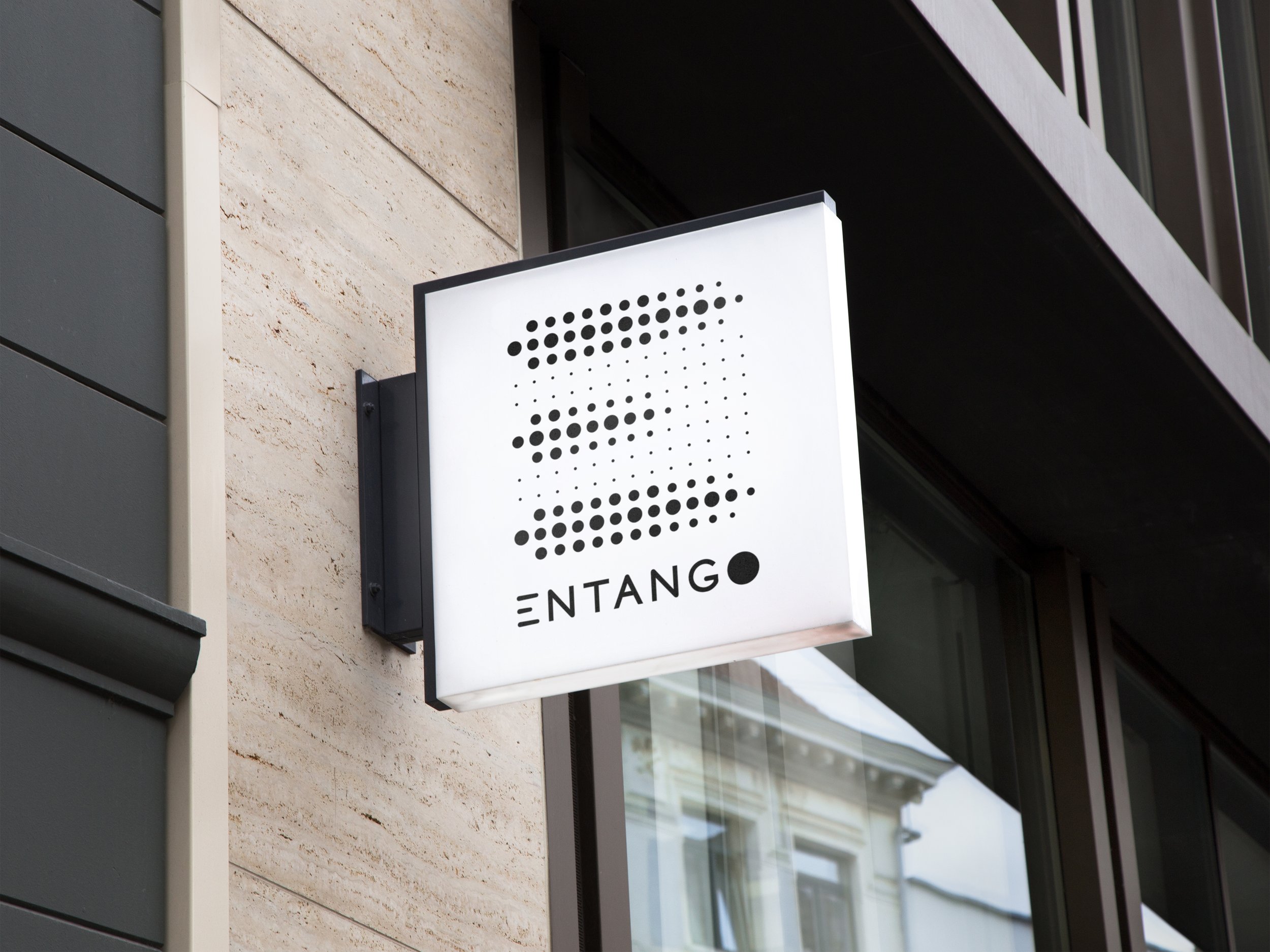
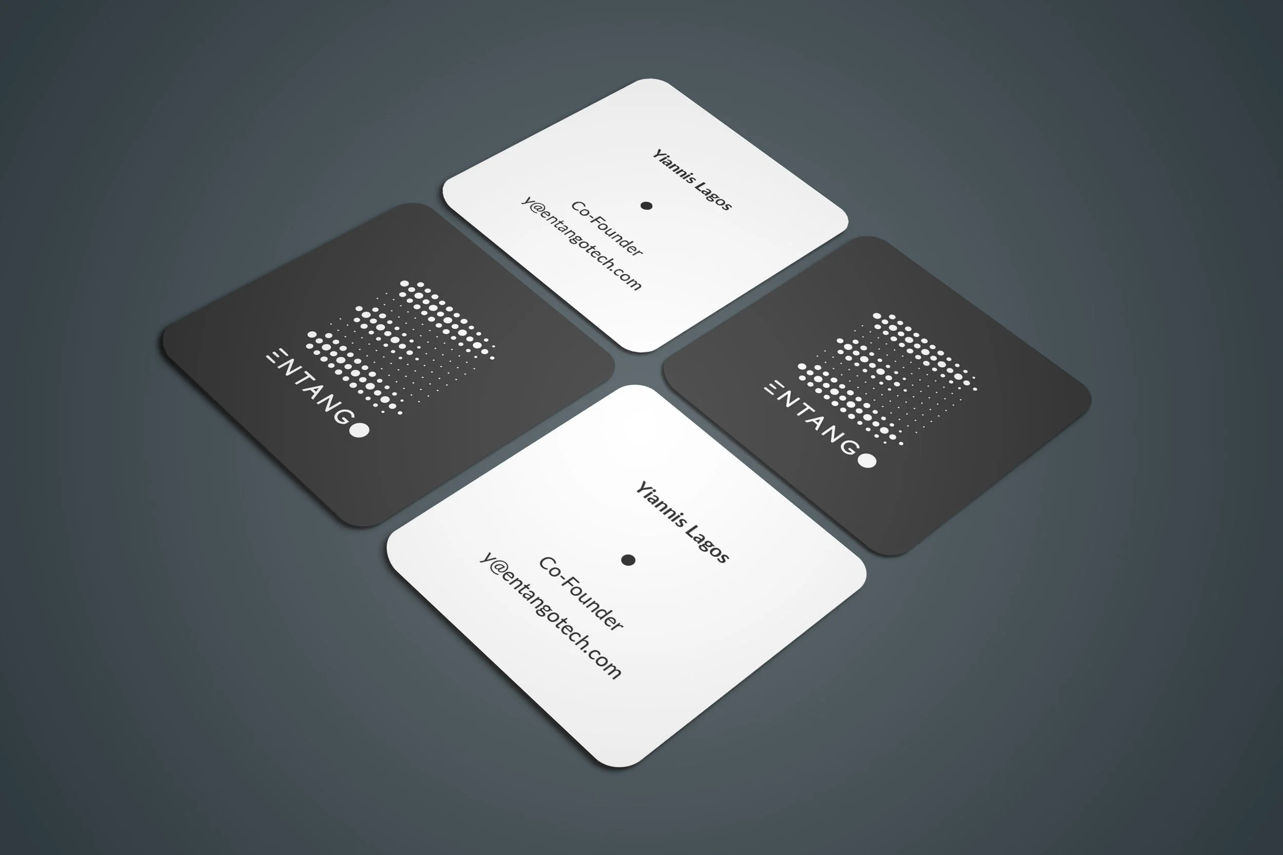
ENTANGO
Brand Identity · UI/UX Design
Entango was built to simplify text messaging campaigns — giving businesses a smarter way to communicate with their audience at scale.
The brand concept came from the product itself. Entanglement — the idea of two things becoming permanently connected through communication. That became the visual and conceptual foundation for everything.
I designed the logo, brand identity and the UI components and assets that lived inside the app — making sure the brand translated seamlessly from first impression to daily use.
Working embedded in a team of five developers, the role went beyond design. I was the connector between the people building the product — making sure communication was clear, the team was supported and the work could move forward without friction.
Sometimes the best design work happens between the pixels.
Majo is a skilled and effective graphic designer, always finding a way to elegantly and beautifully express the wishes of the client or project's needs. She is a reliable listener, takes in feedback constructively, and delivers timely and accurate work. It's been a pleasure working with Majo and I can wholeheartedly recommend her to anyone needing skilled design work to meet specific needs. Her warm and kind personality shines through in all interactions and make working with her simple and effective.
— Eliot Estep